


HOW TO CHOOSE FURNITURE COLOR
Decorating your home can be super fun… and super overwhelming. When faced with a gigantic blank slate, it can be difficult to know exactly where to begin. With paint? With the perfect modern sectional? What about that piece of art you love? While you’re trying to decide on all these different things, we can definitely offer some tips on how to choose furniture color.
DECORATING WITH NATURAL TONES & MODERN DESIGN
When you think of natural tones and interior design, you might envision a boring, builder’s-beige home out in the middle of a cookie-cutter suburb. All of the houses look the same, and you can’t find a drop of character in sight. Yawn.
The reality is, that when done right, a color palette inspired by nature can be all sorts of enticing. Not only that, but there are real psychological benefits to inviting natural tones and textures into your space.
So, how can you create a space with natural tones that isn’t boring? We’ve put together this guide so you can live out your neutral-home dreams.

WHAT ARE “NATURAL TONES?”
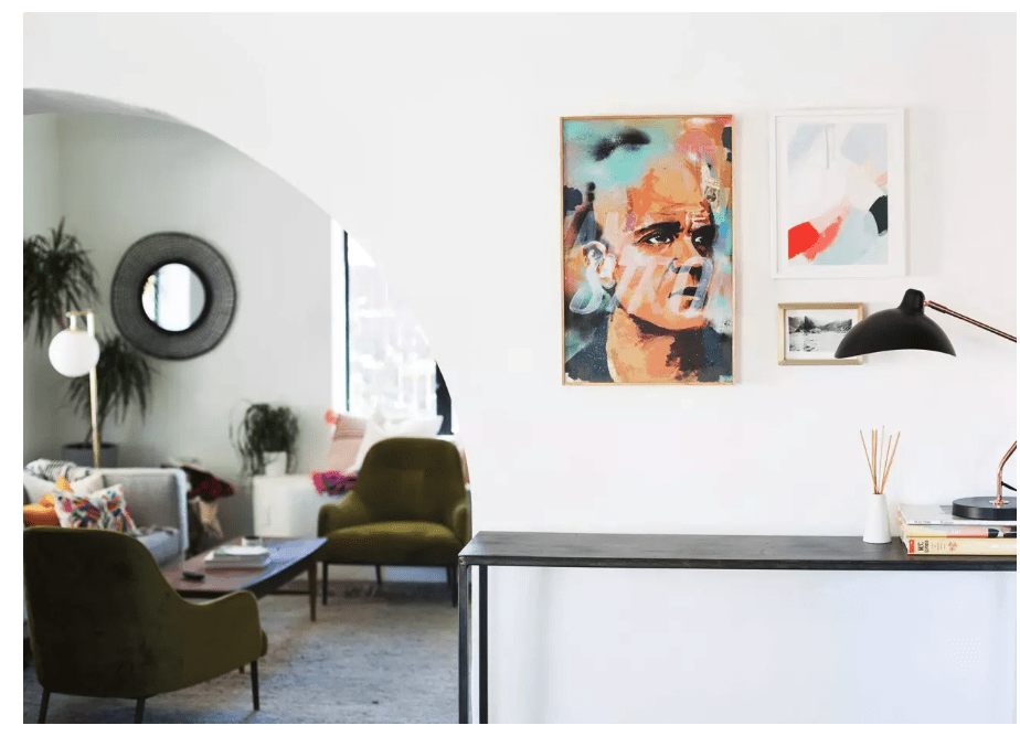
While technically almost every shade under the rainbow can be found in nature, “natural tones” in the world of modern interior design & decor primarily refer to neutral hues and minimally-treated natural materials like woods, rattans, leathers, and wools.
Black, white, ivory, beige, grey, brown, ochre, and rust are all shades that can be layered and mixed without much risk of clashing or a design faux pas. Due to this flexibility and versatility of these colors, there’s little chance that these shades will go out of style or feel dated anytime soon.
As Denise Turner, color expert, owner of the consultant business called Color Turners, and member of the Color Marketing Group Board of Directors explains “Neutrals continue to flourish, as companions for brighter hues or as standalone, monochromatic color schemes.”
THE BENEFITS OF NATURAL TONES
Although often overlooked in favour of bright pops of color, neutrals and natural tones deserve their moment in the spotlight, too. Here are some of the key benefits of decorating with natural tones:
- Easy to mix and match: While you might have had to bring a sample of your modern sofa’s fabric to the paint store in the past, there’s little chance of choosing clashing colors when you deal with neutrals
- Longevity: That gray sofa you invest in this year is unlikely to go out of style anytime soon. You can buy it today and feel confident that your choice will continue to look modern and up-to-date for years to come. When you have a neutral backdrop such as this, you can switch up your throw pillows and accessories when you need a change — without having to replace the modern sofa you’ve already fallen in love with.
- Uncluttered: Even if you fill your space with tons of oversized furniture, accessories, and artwork, natural tones will keep it from looking and feeling cluttered. When you design a room with a neutral palette, your eye is able to take in the space without being distracted and overwhelmed with countless focal points and visual clutter.
FURNITURE COLOR IS PERSONAL
First off, it’s important to consider how color influences feeling. While there are some scientific correlations (such as yellow making you feel positive and hopeful, or blue making you feel calm and at peace), there are also personal ones. Maybe you loved the turquoise toilet of your childhood. Or your first boyfriend’s apartment was painted lilac, but curiously smelled like Cheeto dust, so lilac as a genre is ruined for you. Whatever your personal associations with color, they’ll influence the shades you want in your home. Personal comfort should always trump trend: when making a shortlist of your favorite pieces, be sure to check in with yourself as to whether you’re picking a particular chair for the ‘gram, or because you know it’s going to be a great long term investment. If you’re really struggling to identify your home-style, take some cues from your closet. What colors do you gravitate towards on a daily basis? Are you an adventurous dresser? Take these cues to heart as you consider how to choose your furniture color.

WHAT COMES FIRST, THE PAINT OR THE FURNITURE?
When you’re trying to figure out how to choose modern furniture for your living space, you might be tempted to paint the whole dang thing and then decide. Paint seems like a good foundation, right? If you’re planning on painting your house white, then go for it. But if you’re more adventurous with color, are considering a feature wall, or just aren’t sure… maybe hold off the rollers.
Choosing your furniture first helps you hone in on a palette more naturally. If you find yourself gravitating to really strong, bright colors for your chairs and sofas, a neutral wall color is easy to style against. But what if you fall in love with a sofa — like, head over heels, can’t eat, can’t sleep in love with this sofa — and it only comes in neutral colors? The sofa and you belong together, so it’s coming home. But you might want to change up your wall color to accommodate this unexpected change in plan. Remember: paint options are infinite, but furniture comes in a specific selection of shapes and colors.
This living room has a varied colour scheme featuring greens, golds, husk browns, grey tones and a standalone off-white sofa, yet everything works to create a cohesive look | Designed by Rodolfo Dordoni for © Minotti London
When choosing the furniture colour for a space, there are several factors one should consider, including:
- The size and shape of the area
- The style of the room
- The atmosphere one wishes to create
- The amount of natural light
- Other colours included in the room’s decor
Colour is a powerful tool that can be used to set different moods in any room. As such, a good starting point when choosing furniture colour is to consider the mood and atmosphere one wishes to create.
Deciding on the purpose of the space before committing to a specific furniture colour scheme is essential to creating a cohesive aesthetic and harmonious atmosphere.
Colour Psychology: How Colours Affect Space
The psychology of colours in interior design is important when choosing sofas, armchairs, coffee tables and other furniture, whether that be for a home, hotel or an office.
Here’s how different furniture colours affect the mood of a space:
Red

Red is a powerful colour often associated with passion and intensity. Since ancient civilizations, the colour red has been used in royal palaces, by royalty and nobles around the world. Red can also stimulate conversation in living rooms and other social areas, which is why it’s often a popular choice for sofas and armchairs.
Yellow
Yellow is a colour that universally symbolises happiness and optimism. It is the colour of the sun, hope and renewal. Yellow can be bright and cheerful or warm and inviting.
Yellow can also help to brighten dark spaces and make them appear more expansive. For example, a yellow sofa can liven up a living room, while yellow armchairs and ottomans add an accent of brightness to an otherwise neutral space.
Blue
Blue is a calming colour that helps people to feel comfortable and relaxed. It’s one of the most popular furniture colours in interior design because of its versatility. It is a perfect furniture colour for bedroom furniture and living room sofas as it creates an atmosphere of tranquillity and relaxation.
A popular colour choice for walls, blue is a hue that works well with many different furniture colours. When deciding what furniture colour goes with blue walls, it’s important to consider the undertones in the blue wall colour.
For example, a light grey-blue may have subtle green tones that can be played up by pairing it with teal furniture or make the most of its blue-grey tones by introducing purple-blue accents.
Black

Black represents strength and elegance. This colour complements a sophisticated environment adding an air of elegance to any room. Pairing black furniture with light walls will create a modern and elegant feel.
As a particularly striking yet neutral colour, black is a popular colour for sofas, especially leather ones and can be used to create a variety of styles and atmospheres. Thanks to its versatility, a black sofa can be used both in modern and classic homes and works well in practically any room.
White
White is often associated with cleanliness but is also connected to feelings of calm and serenity. This makes white ideal for bedroom and living room furniture, such as beds, sofas and bedside tables.
White is a popular colour because it is timeless and allows for many different styles and other colours to work together. White furniture can be dressed up easily with decorative accessories to add vibrant splashes of colour and liven the space.
Grey
Grey is a great colour for adding depth to rooms without becoming too overpowering. It can also help neutralise any powerful tones in the room, creating a calming atmosphere that feels harmonious.
Grey furniture, such as grey sofas or armchairs, is most commonly used in contemporary homes and works exceptionally well when paired with white or pastel finishes.
5 Ways to Choose Furniture Colours
The colour of furniture has a significant impact on the atmosphere of a space. While it’s no secret that some colours are warm and inviting, while others are cool and relaxing, there is an art to knowing which colours work well together.
Colour theory is regularly employed in the world of interior design and a thorough understanding of it can go a long way when planning a project.
Consider the Overall Design of the Space
When choosing the furniture colour, it’s important to consider the colour of the walls and floor materials. A general rule is to choose furniture colours that are different from the wall and floor colours in both character and intensity.
For example, light-coloured furniture paired with wooden floors will create a smart and polished space. However, if a room has very light walls, then dark furniture will make it feel dignified and harmonious.
Understand Lighting and Colour
Natural and artificial lighting play an important role in the perception of colour. It is important to understand how lighting affects furniture tones before committing to a specific colour.
For example, warm colours such as reds and yellows will look brighter in natural sunlight than in artificial light. In addition, different types of artificial light can change the way a colour looks: incandescent bulbs tend to make colours warmer, while fluorescent bulbs may make them look cooler or bluer.
Choose an Analogous or Complementary Colour Scheme
An analogous colour palette uses colours in close hues and shades that work well together because they naturally complement one another and is often used to create a warm and inviting atmosphere. Such a scheme can be introduced through the introduction of a red sofa, an orange rug and yellow decorative elements.
On the other hand, a complementary colour scheme tends to be more vibrant than an analogous scheme. Contrasting furniture colours create a dynamic atmosphere in any room. For example, the complementary colour scheme can be implemented by a navy blue sofa decorated with mustard yellow cushions.
Use the 60-30-10 Rule
The 60-30-10 rule states that the main colour should represent 60% of the room’s colour palette, the secondary colour should represent 30% and the accent colour should represent 10%.
When using this rule, the dominant colour is usually found in walls, large furniture and flooring while the secondary colour is used for upholstery and window treatments. The accent colour then is used in accessories such as pillows, artwork, flowers and other décor.
Implement the Rule of Three
The rule of three can be used to create beautiful and harmonious colour schemes in a space. It is a simple concept consisting of choosing three colours for the walls and furniture of a room and using them in equal parts.
Furniture colours from the same colour family but in different shades and levels of saturation, such as a navy blue sofa, with aqua blue cushions and sky blue ottoman, work best when implementing this rule.
Conclusion: Tips to Choose Furniture Colour
Furniture colour can be used to introduce an extra touch of joy and warmth to any room while highlighting specific elements and evoking certain feelings and emotions.
As an integral part of interior design, colours affect not just the look and feel of a room but also the mood of its inhabitants, which is why it’s so important to find the right blend of colours for a specific space.
To summarise then, one may consider using the tips covered in this guide when selecting the colour of the furniture in a space:
- Consider the overall design of the room
- Understand how lighting affects colour
- Choose an analogous or complementary colour scheme
- Use the 60-30-10 rule
- Implement the rule of three